Friday, April 30, 2010
Fifth Week - Visual Research
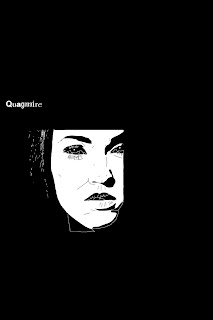
In the past weeks, I've looked at a number of film posters. The two I designed this week are more akin to the visual research I did last week. Still, I very much liked these two when I came across them this week. They have a bit more hand drawn feel. Both still have very controlled pallets, although the shading is more gradual. I also enjoy that both images play with the idea of obscuring the face.
Thursday, April 22, 2010
Fourth Week - Visual Research
I enjoy the elegant color scheme of this poster. The abstract cutout look is complimented very nicely by the title design for "Critters." The "small text" is placed irregularly to the right of the globe, creating a "shadow."
This poster for the film "Fatal Attraction" also has a very elegant color scheme. The red apple and the snake are classic symbols of seduction. The hand at the end of the snake's tail is reminiscent of the "ouroboros," an ancient symbol in which a snake or serpent is depicted as swallowing its own tail. In this way, the poster suggests that the seducer and the seducee are two parts of the same world view. The desire to resist seduction must be accompanied by a desire to seduce. The method used to draw the hand and apple was probably similar to the method we used in class to draw from a photograph by computer.
Fourth Week - Something I Did
Assignment 4 - Salvador Dali Portrait
I drew this portrait of artist Salvador Dali, from the photograph below. I used the same techniques that I used previously to create the Miro Portrait. This time, I wanted to challenge myself to create a larger image, with more detail.
Tuesday, April 20, 2010
Assignment 4 - Miro MetaPortrait
For this project, I drew a portrait of the French surrealist John Miro, from the photograph below. I broke his face into abstract blocks of color, reminiscent of his characteristic style. Colors were positioned according to a similar mathematical principal as that Miro used in his paintings. I slanted the image, so it would be a bit skewed, adding to the playful dadaist feel. I partially surrounded the artist's head with selected paintings (by him). Finally broke up the canvas by adding yellow triangles in three of the four corners, akin to Miro's use of asymmetry.
Thursday, April 15, 2010
Third Week - Visual Research
I like the collage elements of this poster. The unfinished quality of it makes it look less professional, yet more professional at the same time. It's unfinished enough that it has an intentional quality to it. I also enjoy the very simple colour scheme.
I enjoy the use of the poster surface itself as a subject of the design. The writing in blood is clearly written on the poster itself, or else on a piece of glass, like a window, which is otherwise not transparent. The dripping blood in the previous poster has a similar concept behind it. In both cases, the design reminds the viewer that they are in fact looking at a poster, not the subject within the poster; in that sense the designs are quite Brechtian.
Now here's a very avant garde use of collage. Very comedic and also kind of disturbing. Definitely gives the impression of a black comedy. Like the first poster, the intentionally unfinished nature of the design, the hand-made, almost unprofessional style is very compelling.
Reminiscent of Magritte's "Son of Man," this enigmatic image of a man with a type-writer obstructing his face challenges us to see behind the surface. The man and the object blend, yet are at war with one another, a comment on the nature of modern life.
Wednesday, April 14, 2010
Third Week -Something I Did
Thursday, April 8, 2010
Second Week - Something I Did
Wednesday, April 7, 2010
Assignment 2 -Picturing the Other
Thursday, April 1, 2010
Assignment 1 - Self Portrait
I started with a photo of myself, then drew abstract shapes around my face. Finally, I used effects and filters on the individual layers. The result is this Keith Haring inspired self portrait. The color scheme was inspired by an 18th century tradition to use shades of purple in backgrounds of self portraits. The technique is supposed to set off the face, drawing dramatic attention to features. Since the face is abstracted, the feeling imposed on the viewer should be somewhat ironic, in the postmodern tradition.
-Peter
Subscribe to:
Posts (Atom)